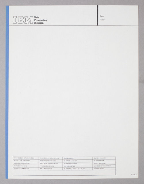
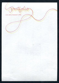
Wms & Co. 
wmscoink.com
AmassBlog

big blue continues

JP Williams

i enjoy searching for vintage ibm materials. i recently purchased a new book (at least new to me): 'the interface, ibm and the transformation of corporate design.' i have only skimmed it, but it has already heightened the pleasure i take in that period of design.

i started out as a lover of corporate identity, long before the phrase 'branding' was used. i often prefer to use the word 'identity.' it's more manageable, in my mind, and often more relevant to many of the clients with whom i work. i'm not sure if rand designed this letterhead, but i expect so. i would guess it's a relatively early design given the logo. rand was designing pretty much all ibm's materials himself during the early years. there should be an exhibition of just the ibm stationery materials. there were vast quantities of them. i believe at one time ibm was responsible for using more paper for promotional materials and company literature than any other company in the world. incredible. i remember interviewing at saatchi in the '80s. i was told that i would be working primarily on the ibm account and was asked how i felt about bodoni. since it was the ibm house font, i gathered i wouldn't be using anything else. this letterhead is certainly before those days. i love the use of city typeface, too. it works perfectly for me. and that blue edge….hey, i'm a happy collector.

Wms & Co. 
wmscoink.com
AmassBlog

Comments

Post Comment
I like that: "happy collector".
ginareply
Its funny, not to be demeaning but this post reminds me of that scene in 'American Psycho' where the boys all show their business cards and then rhapsodize about one in particular for its exquisite design when in fact the card as far as a 'normal' person could tell was just a basic business card. That scene has always stuck with me.
barneyreply