an exhibition at P! has inspired me and made me pull a few books off my shelf to consider the typography of ‘neue typogrpahie.’ the current exhibition presents the work of klaus wittkugel, an east german designer during the height of the ‘neue typographie’ movement. i was not previously familiar with his work but am very familiar with the typographic design of this period. i have long been an admirer of this movement in typography and love the contrast created on a simple typographic page.
the owner of P! gallery, prem krishnamurthy and i met when i made a call to visit his gallery i asked to see pieces from the karel martens exhibition. i never saw his exhibition (something i regret often) but, when i finally made it over to the gallery, prem shared many wonderful pieces. i am now a proud owner of an original karel martens monoprint.
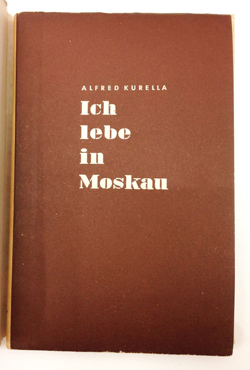
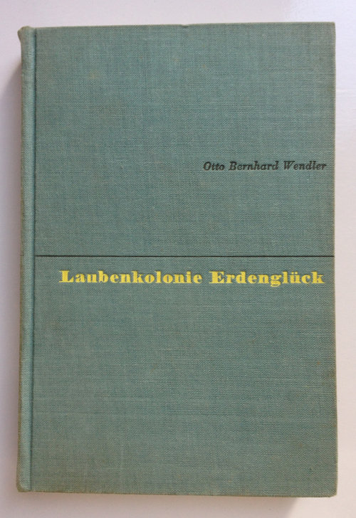
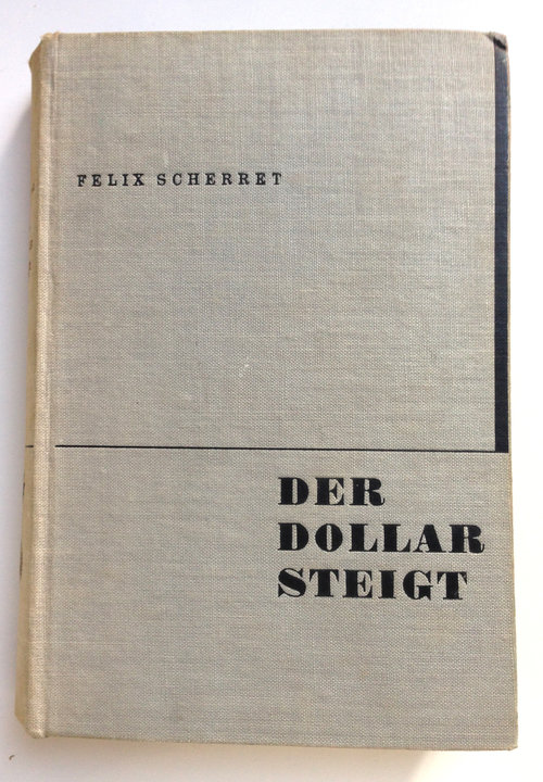
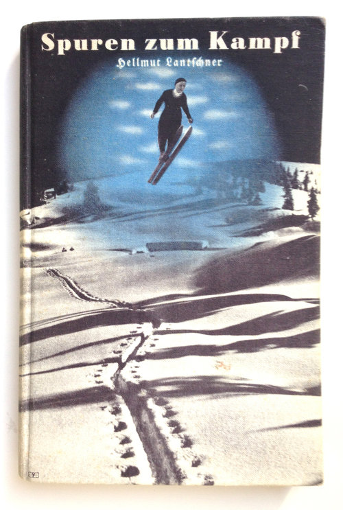
there are some excellent specimens of wittkugel’s work and, though he does not exhibit the skill or refinement of tschihold, it nonetheless excites me to see another designer working at this time. here are a few images from the P! gallery, as well as a few books designed by tschichold and herbert bayer from my collection. i have collected this category of german book design for years and i needed to return to my shelves to explore the similarities. the book, “it lebe in moskay,” is designed by wittkugel and the others are designed by bayer and tschichold. they all feel of a family; of a time. the contrast between typographic placement and weight stands out. when i visited the used books stores in berlin and vienna a couple of years ago, it was easy to spot these books on the shelf: the spines are distinctive and stand out from the surrounding titles. it is always a thrill to remove one from the shelf and see the credit. similar to the thrill i had in visiting this show. be sure to stop by.


