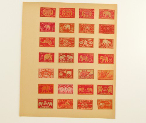
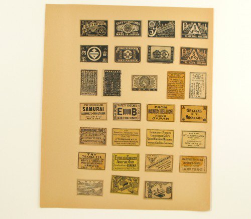
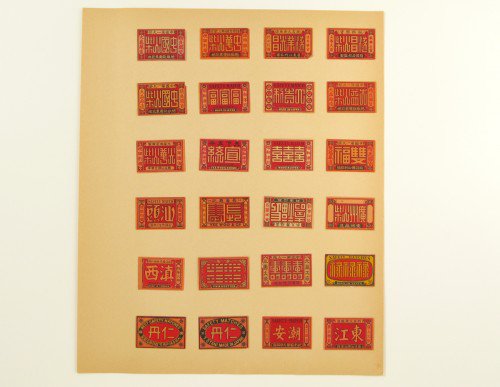
my motto, or one of them, is "you're only a good as the obscurity of your sources." when i begin a project—or, frankly, even before a even get a project—my head spins with ideas. what about this? no—that!? that's too far out. where should the client take this? whom are they trying to reach? their brand is great but they have forgotten their core. i review myriad possibilities and have endless discussions with myself. generally i have a meeting with a client and gauge where they want to go, and that usually narrows down the avenues. many times, my collections come in handy as inspirations and a resource. i rarely buy things or books specifically as sources or references—“this book will be good for letterforms" or "this is good for patterns." my collections serve me for visual stimulus and what i think will be the foundations for an interesting design somewhere down the line. my collections have also been a way for me to dream. i have dreamed of opening a store for years. (my daughter has even wished she would win the lottery just so she could give me the money to open that store.) many times my collections do aid in the design of a project or to just stimulate discussion with other designers. like this one: hundreds and hundreds of matchbook labels collected by one person. i love that this individual collector had taken the time to organize them topically and visually by color. i bought these because it was such a comprehensive collection, rich with design and history, and because i thought they would look amazing framed. imagine all the red, the black, each a blur of color, only to discover the nuances separating one from the next. many collectors of matchbook labels collect them topically; elephants, birds, deer, etc. but of course i love the typography, the illustrations and the color. we recently did a project for a men's store in mexico city, silver deer. when the client came to us, he already had the name and a clear idea, however done by another designer, of what the store should look like. well, we tried (and i think successfully) to take him in another direction. we started here, looking at these old matchbook labels of deer, but after a while we felt it looked too specific and too familiar. we eventually presented a more clean and stark identity, a fresh canvas to sell the heritage brands the client was passionate about. i am proud of the design but my heart still has a soft spot for these matchbox labels. it's wonderful to see the depth and richness that can be conveyed in something that is only 2 inches across. enjoy.