Wms & Co. wmscoink.com
Amassblog
Letterhead from the original Mr. Chow
letterhead from mr chow

mr chow

JP Williams


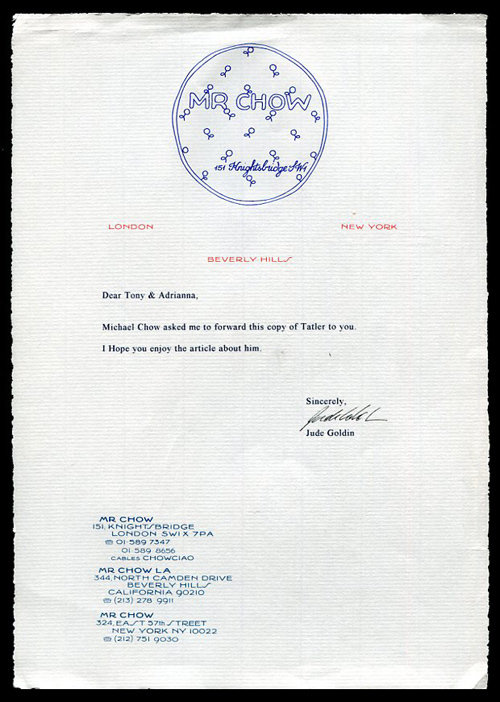
i moved to new york in 1989 and i’ve only been to mr. chow's once. it’s expensive, but frankly i don't remember the food. i do love the letterhead, though. i have absolutely no memory of where i found this. i have racked my brain, but for the life of me i simply cannot remember. (actually, i've since learned it's my wifes - she loves mr chow from her club days).

for a so-called modernist i certainly have many examples that do not fit into that narrow category. i actually believe i have more that doesn't. there is a great deal i like about this letterhead. i appreciate it because i don't think i could have designed it. one of the best reasons to work with other designers is because of their unique ‘voices.’ being of a certain age, i tend to gravitate to particular typefaces, stay within a comfort zone, i simply do not see certain possiblitlies. design is often a team effort, sharing the discovery and the solution is rewarding. what strikes me in particular about this design is the laid paper. a perfect choice. i have rarely specified laid paper, not sure why. typefaces are everything when designing a letterhead and the choices here is spot on. i remember when i taught typography and had a long discussion about choosing a typeface. one student had selected a specific typeface for his resume. stealth. the name of the font says it all. my questions to this particular student was, ‘what does this say about you? does it say too much? how “designed” do you want something to be? what note do you want to hit?’ mr. chow's letterhead really resonates with me. maybe it does with you?

Comments

Post Comment
This is a lovely letterhead, but it is a direct copy of the letterhead of Emile-Jacques Ruhlmann, the great Art Deco furniture and interior designer. Only steal from the best!
This is a lovely letterhead, but it is a direct quote from the letterhead used by Emile-Jacques Ruhlmann, the great French Art Deco furniture and interior designer. Always steal from the best!
I have been trying to leave a comment here, but it doesn't seem to ever show up. This letterhead is pretty much a direct copy of Emile-Jacques Ruhlmann's letterhead from the 1920s. Ruhlmann was a furniture and interior designer in Paris, the epitome of Art Deco.
'Stealth' doesnt look so stealthy to me. Possibly because Im not a ninja? It looks more like broken noodles on the tiles. That may also be a ninja thing... Mr Chow; I do like the text just slotting in between the flower-pattern; pleasingly frustrating enough to make me pay attention. + the asymmetrical address in the cartouche, kind of a counterpoint to that slick font used for the cities etc... ps glad youve been posting more lately... appreciate that.
This is a direct adaptation of the letterhead used by the great Art Deco furniture and interior designer Emile-Jacques Ruhlmann. Only steal from the best!
actually, I think this is mine ;)
your wifereply
yes allison it is yours. :)
I read this blog of yours last year, and felt that this letterhead looked familiar. It all clicked into place when my mother served up christmas lunch on beautiful bone china plates adorned with the Mr Chow logo in gold foil!
arranreply