how often have you heard "the printer did it"? when i first started out as a designer there would a stream of paper promotions arriving at the design studios i worked. usually followed up by a call from the paper company's representative, "did you get our latest promotion?" when was the last time that happened? the promotions which were luxuriously printed would be passed around the studio and later in my own studio, the most deserving of these promotions were placed in a box labeled 'beautiful items'.
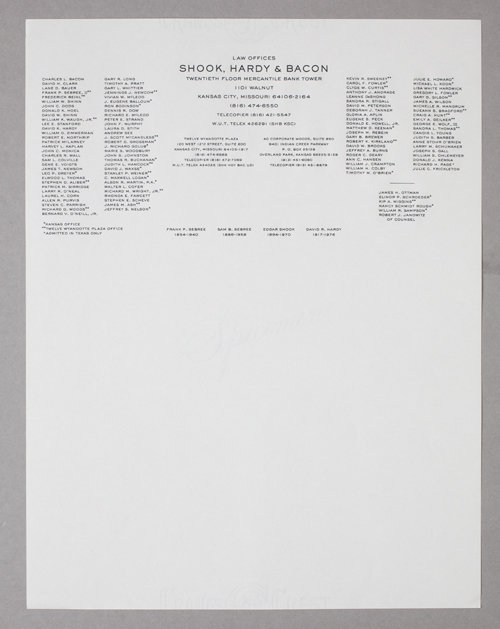
since I collected letterheads, whenever a promotion landed in the studio which had letterhead samples, usually to highlight a specific paper stock, i took special notice. if a desirable letterhead appeared i would put it aside. here is one such example. the law firm of shook, hardy & bacon. i don't remember when i obtained this example, most likely in the 80s, but it has been a favorite from the school of 'the printer did it'. this letterhead is beautifully engraved, listing over a hundred lawyers. certainly a letter received on this letterhead conveyed a formidable message. a google search to their website reveals it is apparent that they have since hired a designer and now have a 'logo' and i expect the letterhead is 'more' considered but i would not expect it be have quite the same impact. each time i look at it and marvel at the simple and straightforwardness of it's design. dare i say it's 'honest' intentions.
i recently designed a logotype for a boutique insurance broker firm but initially the client had the printer do it, engraver actually. i made a presentation with various degrees away from what the engraver had done to a rather expressive design using baskerville italics. the client narrowed it down to two designs; one which was just slightly but clearly more considered typestyle than what the engraver had done to one which was obviously 'designed'. the client asked me which i preferred and i summed it up like this, 'clearly one designed you paid a lot for and the other looks old school, more straightforward — honest."
guess which one he selected. honest it is!


