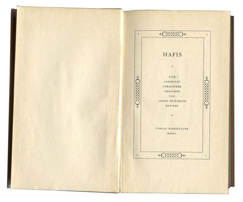
i pay attention to title pages and i have many that i admire. is it silly to buy a book for its title page? i previously shared the book by ee cumings and i wonder: is the title page similar to the letterhead, in that both are defined, limited spaces? the title page sets the tone for me. the skill of the designer is revealed within this page.
this example is designed by jan tschichold. i collect books he designed during the pre-war years but also those from the ensuing era, when he recanted the dogma of neue typographie and designed in a traditional style. his penguin years exemplify this. his ability to design a page, to orchestrate the page and balance the elements, always seems right to me. when teaching typography, i think it is important to strive for a design in which the addition of another element alters it in such a way as to take away from a balanced composition; no matter if it's a traditional design or an asymmetrical one. reaching this stage can be a struggle. when i look at tschichold's work, I feel the design would become something else if another element were added (or something subtracted). i remember in school taking a two-inch black square and placing it in a ten-inch white square, and the teacher asking me to move it around. if placed it in the center, it said one thing; moving it to the edge said another. the composition changed dramatically. so simple, yet so powerful. i have often sat and done this exercise with a student. with each movement of the square we talked about how it changes our perception of the page. the thinking is that using type enhances the composition, gives it more purpose. i think it took me twenty years to understand and articulate this. remember when you were doing all these exercises? now, when i look at a title page, i am rewarded by the care and diligence with which it was composed. maybe you see the same thing?


